Data Engineering Articles
Top 10 Data Integration Project Ideas
9 Most Creative Data Engineering Project Ideas To Kickstart Your Career
Data Engineering Projects: How to Build Real-time Streaming Data Pipelines
10 Useful Tips To Build Your Professional Data Engineer Resume

Get In Touch For Details! Request More Information
Top 8 Data Visualization Tools- Go Easy With Your Data!
Mar 26, 2024 4 Min Read 348 Views
(Last Updated)
A software that takes data from a specified source and returns the visual representation of the same in the most appealing format is a Data Visualization Tool.
Table of contents
- And, why do we need Data Visualization Tools?
- So, what are the top Data Visualization tools?
- Tableau
- Microsoft Power BI
- Zoho Analytics
- Data Wrapper
- Plotly
- Wrapping Up
And, why do we need Data Visualization Tools?
Understanding the data and making sense out of it is better done when we have a pictorial representation of the same. For example, talking about Cricket-the game of numbers!
Imagine, we have a team representing every country, with 11 players in every team. The matches, catches, stumpings; the player details(with a long history of runs, 4’s, 6’s, highest catches, batting average, centuries, and what not?), the umpire details, the extra’s, test crickets, one-day internationals, there are just a lot of numbers.
Agree? Now, what if we carry this data just as mere information? Obviously, we will have many glitches in the information. Also, we might encounter lots of other hurdles in processing the information.
A pictorial representation of player data, like in tables and graphs expresses more than just words. A 2-dimensional and 3-dimensional representation of plots of shot directions & distances on an overhead view of a cricket field represents more data whatsoever.
Above all, the most difficult attribute of understanding the giant amount of complex data finds a fix with Data Visualization. So, Data visualization changes the way we draw insights from data!
To be precise, we can go ahead and
- Discover new insights,
- Spot trends,
- Visualize stories,
- Also, analyze patterns, and more.
Before we move to the next part, you should have a deeper knowledge of data engineering concepts. You can consider enrolling yourself in GUVI’s Data Engineering Career Program, which lets you gain practical experience by developing real-world projects and covers technologies including data cleaning, data visualization, Infrastructure as code, database, shell script, orchestration, cloud services, and many more.
Additionally, if you would like to explore Data Engineering and Big Data through a Self-paced course, try GUVI’s Data Engineering and Big Data self-paced course.
So, what are the top Data Visualization tools?
Among the wide list of Data Visualization tools, here are a few good ones to get started with:
1. Tableau
Tableau Software is one of the top data visualization tools that help make Big Data small, and small data insightful and actionable. Above all, the main use of tableau software is to help people see and understand their data.
Advantages
- Provides automated reporting
- Performs basic ETL operations quickly
- Conducts Investigative or Exploratory Analysis also at high speed
- Awesome Dashboards and Reports
- Above all it is very fast to deploy, easy to learn, and very intuitive to use
- Also, it brings multiple Data Sources to the same place.
Disadvantages of Tableau
- There is no option of scheduling in Tableau. Therefore, there is always some manual effort required when users need to update the data in the back-end.
- Above all, Tableau is not a complete open tool.
- Tableau’s parameters are static and always single value can be selected using a parameter. There is no way a user can automate the updating of parameters.
- The layout of the dashboards gets disturbed if the tableau developer’s screen resolution is different from the end user’s screen resolution
- Data cleansing is also a necessary step, which Tableau does not help with.
2. Microsoft Power BI
This suite is a cloud-based business analysis and intelligence service provided by Microsoft. The three types of Power BI platforms, viz. Power BI Desktop (A desktop application), Power BI Service (SaaS i.e., Software as a Service), & Power BI Mobile (For iOS and Android devices) are a collection of business intelligence and data visualization tools such as software services, apps, and data connectors.
We can also use the datasets imported in Power BI for data visualization and analysis. We can do it easily by making sharable reports, dashboards, and apps. Moreover, Power BI is a user-friendly tool offering impressive drag-and-drop features and self-service capabilities.
Advantages of Power BI
- User-friendly tool offering impressive drag-and-drop features and self-service capabilities
- Power BI is offered at a fair price as compared to other BI tools.
- Power BI’s capability of Excel integration helps users to view and work with the raw data behind a Power BI visualization.
- You can import data from a wide range of data sources.
- Above all, it gets upgraded from Microsoft every month
- It also shocases great accessibility to data sources
- Attractive, intuitive, and interactive visualizations
Disadvantages
- Complex to Understand and Master
- has a limit of ingesting data at a time which is approximately 2 GBs of data.
- Furthermore, the user interface of Power BI is often found crowded and bulky by the users.
- Again, Power BI does not provide many options to configure your visualizations as per your requirements.
- Power BI is good with handling simple relationships between tables in a data model. But, if there are complex relationships between tables a time which is approximately 2 GBs of data.

3. Zoho Analytics
It is one of the top data visualization tools that enable you to analyze data from a wide variety of data sources through easy-to-use data connectors. Zoho Analytics also provides powerful options to model and prepare your data. Most importantly, it enables you to structure, transform & clean your data set for effective and easy analysis & reporting.
Furthermore, with one of the most prolific product development teams in the industry, Zoho constantly stays abreast of its products. They are consistently improving their products, as well as introducing new applications.
Advantages
- Simple to use & robust
- Scalable to a higher version, more users and additional applications.
- Very affordable.
- Good connectivity to other apps and the G-suite.
- Srong features for following up tasks, meeting, calls, etc.
- Also, great workflow tools
- Above all, allows managing all the business in one place.
Disadvantages of using Zoho Analytics
- Integrating can be complicated, and not completely consistent.
- The AI assistant doesn’t seem to add a lot of value.
- Also, you need a clear understanding of your needs to identify which Zoho modules will meet them.
4. Data Wrapper
Data Wrapper helps the top teams to enrich and sell their stories with the most interactive and responsive charts, maps, & tables. Most importantly, no coding skills are required. You can simply copy and paste your data, upload CSV files, or link to a URL. Even Google Sheet allows live-updating charts. It is one of the top data visualization tools.
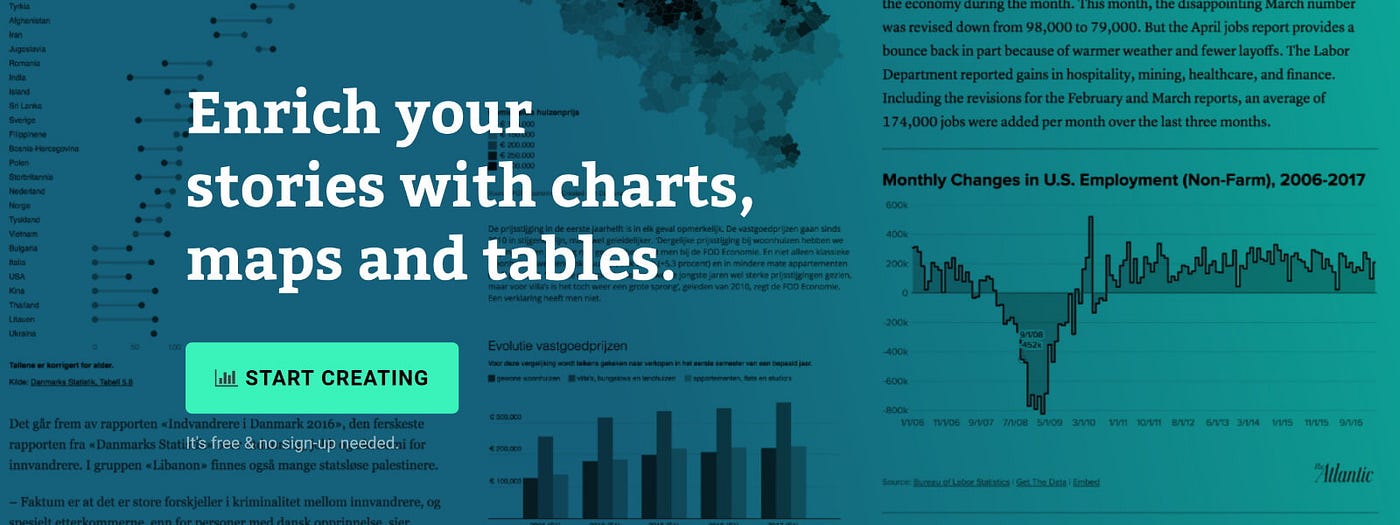
Advantages
- Its quick, clean, and elegant
- One can get started without assistance or any additional training
- Data Wrapper is compatible with most of the operating systems
- Also, there is a large bandwidth of pictorial representations which provides great template.
Cons of Data Wrapper
The only drawbacks that we figured out are the lack of flexibility & difficulty in customizing.
5. Plotly
Plotly is an interactive, open-source plotting library. It supports over 40
unique chart types. If you are looking forward to an interactive environment, then Plotly is the Data Visualization Tool for you! With several use cases, ranging from statistics to finance to geography and more, Plotly provides you with the most talking environment.
Again, Plotly is one of the top data visualization tools you can take up.
Pros of Plotly
- You can create awesome, interactive, and exportable figures in just a few lines of code.
- It is comparatively very flexible tool
Cons of Plotly
- Initial setup to use Plotly seems little ambiguous
- Out-of-date documentation is not of any benefit
Kickstart your career by enrolling in GUVI’s Data Engineering Career Program where you will master technologies like data cleaning, data visualization, Infrastructure as code, database, shell script, orchestration, and cloud services, and build interesting real-life cloud computing projects.
Alternatively, if you want to explore Data Engineering and Big Data through a Self-paced course, try GUVI’s Data Engineering and Big Data Self-Paced course.
Wrapping Up
We have plenty of other Data Visualization tools to include in this list. The list can go on and on…
Fusion Charts, Excel, Google Charts, Dunda’s BI, JupyteR, Visual.ly, RAW, Sisense, Highcharts, QlikView, Looker, Domo, Klipfolio, Sap Analytics Cloud, etc.
Data Visualization plays a significant role when Data comes into the picture.
Read more about Data Visualization here!
For further queries and doubts, leave your contact. We will get back to you shortly.


Did you enjoy this article?